CLIENT: NOTTS ZINE FEST YEAR: 2026
IN SHORT:
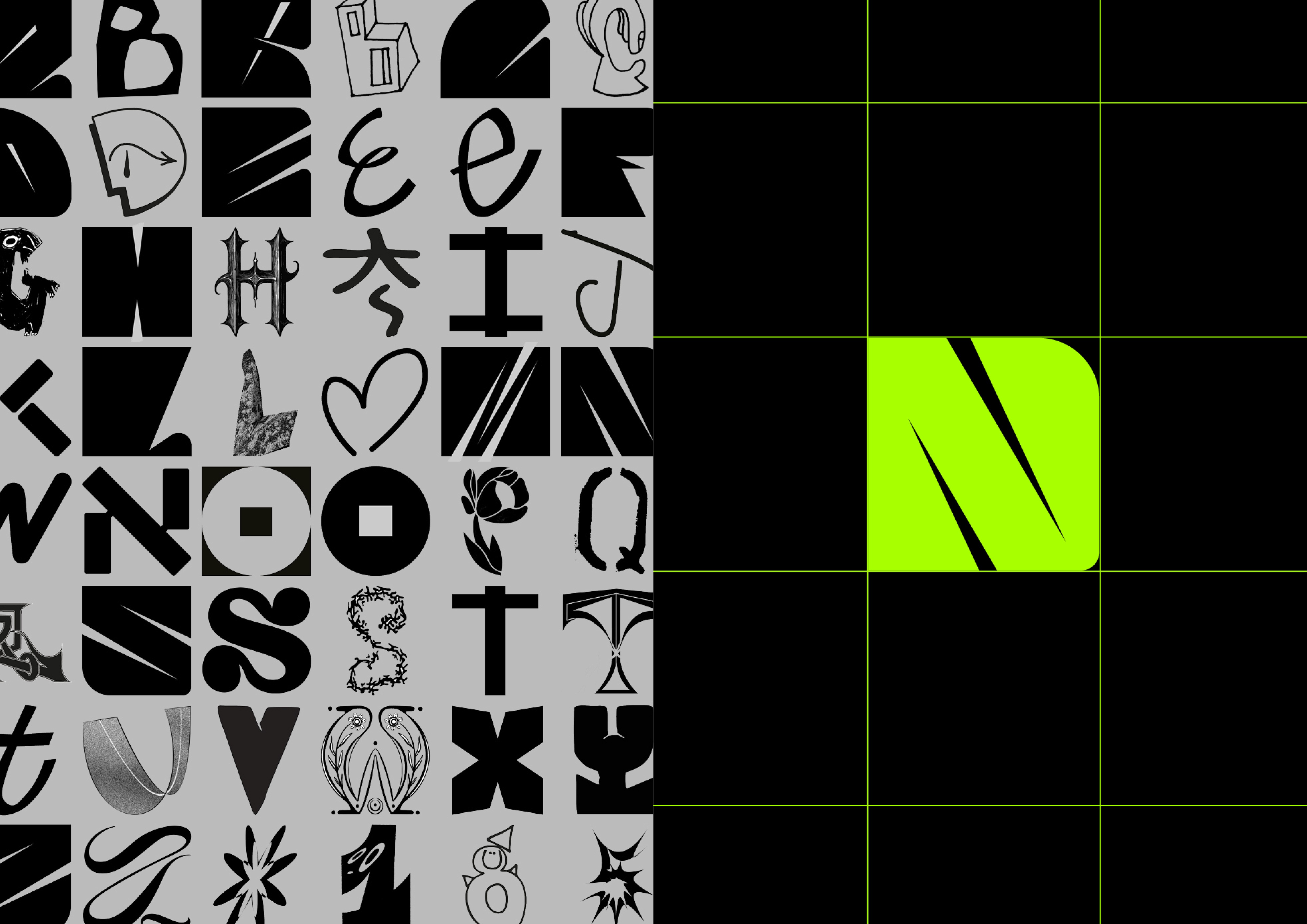
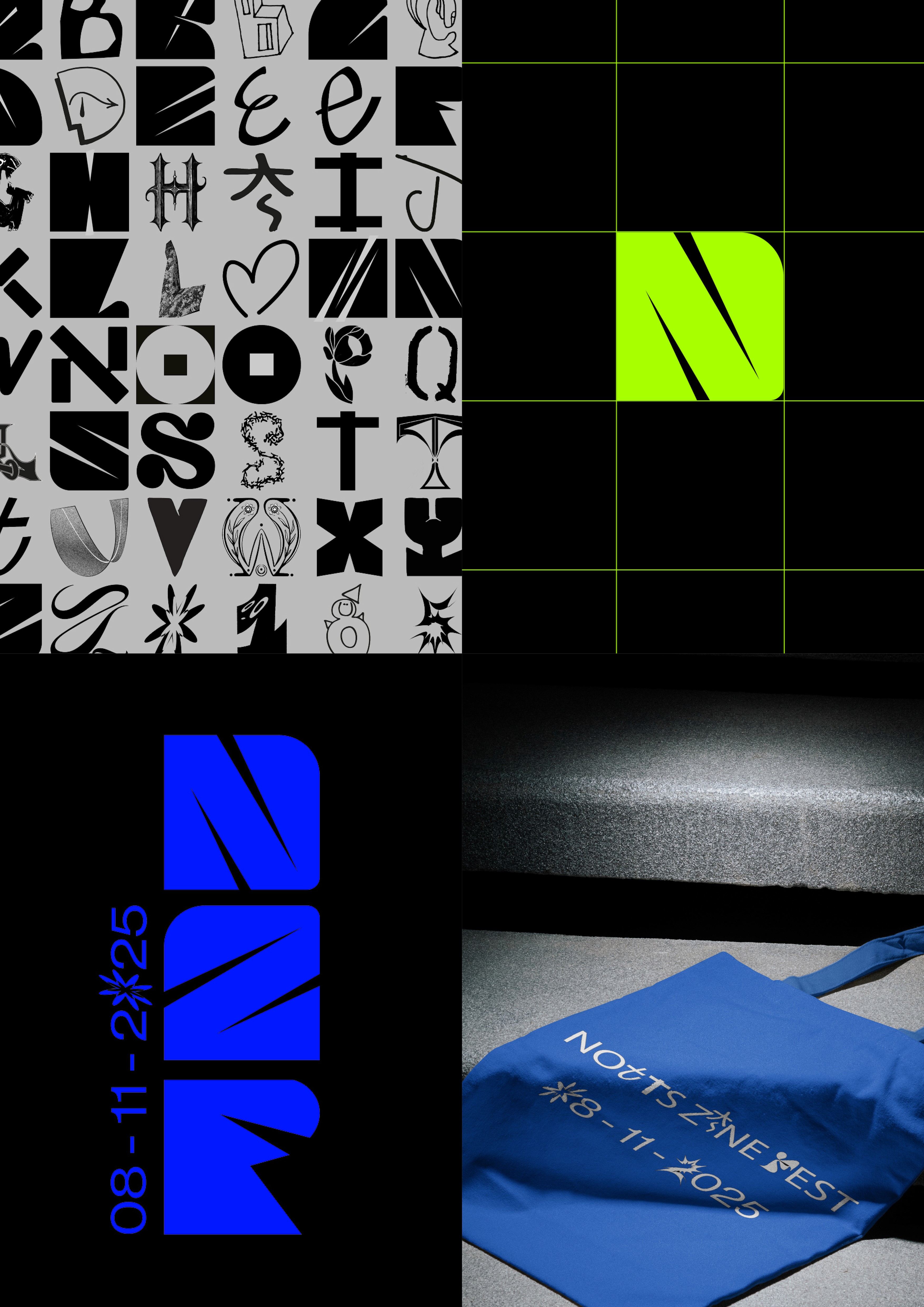
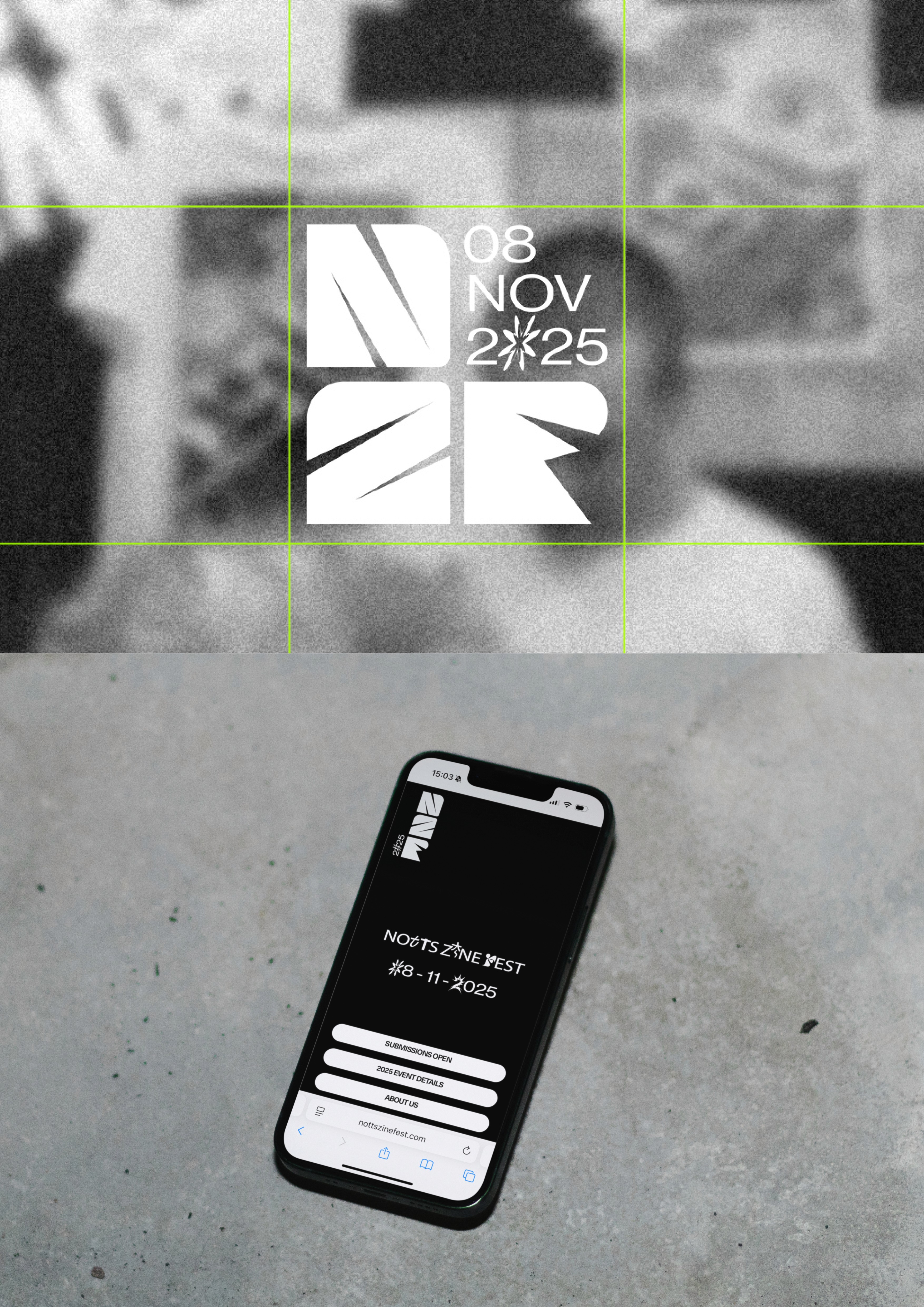
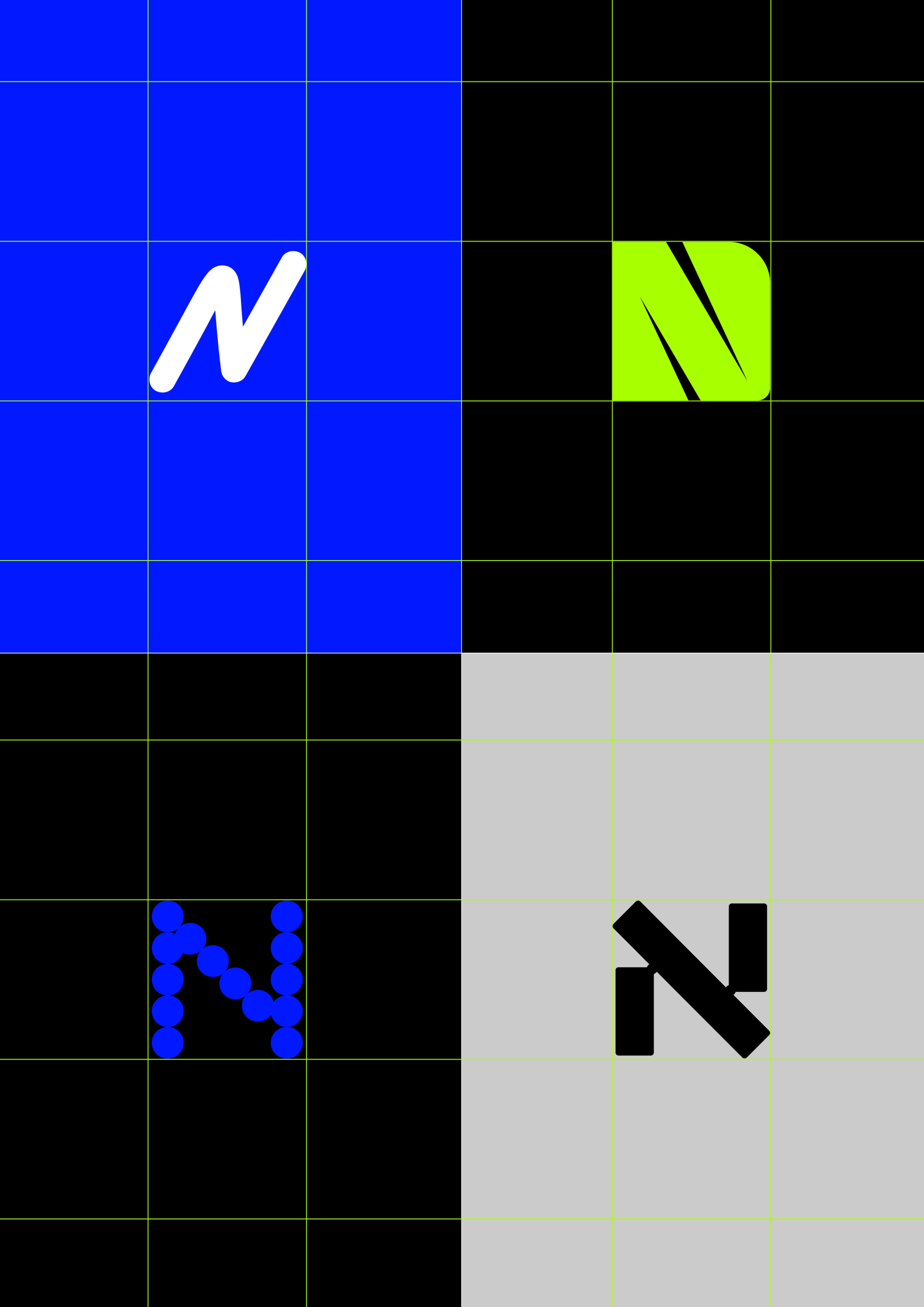
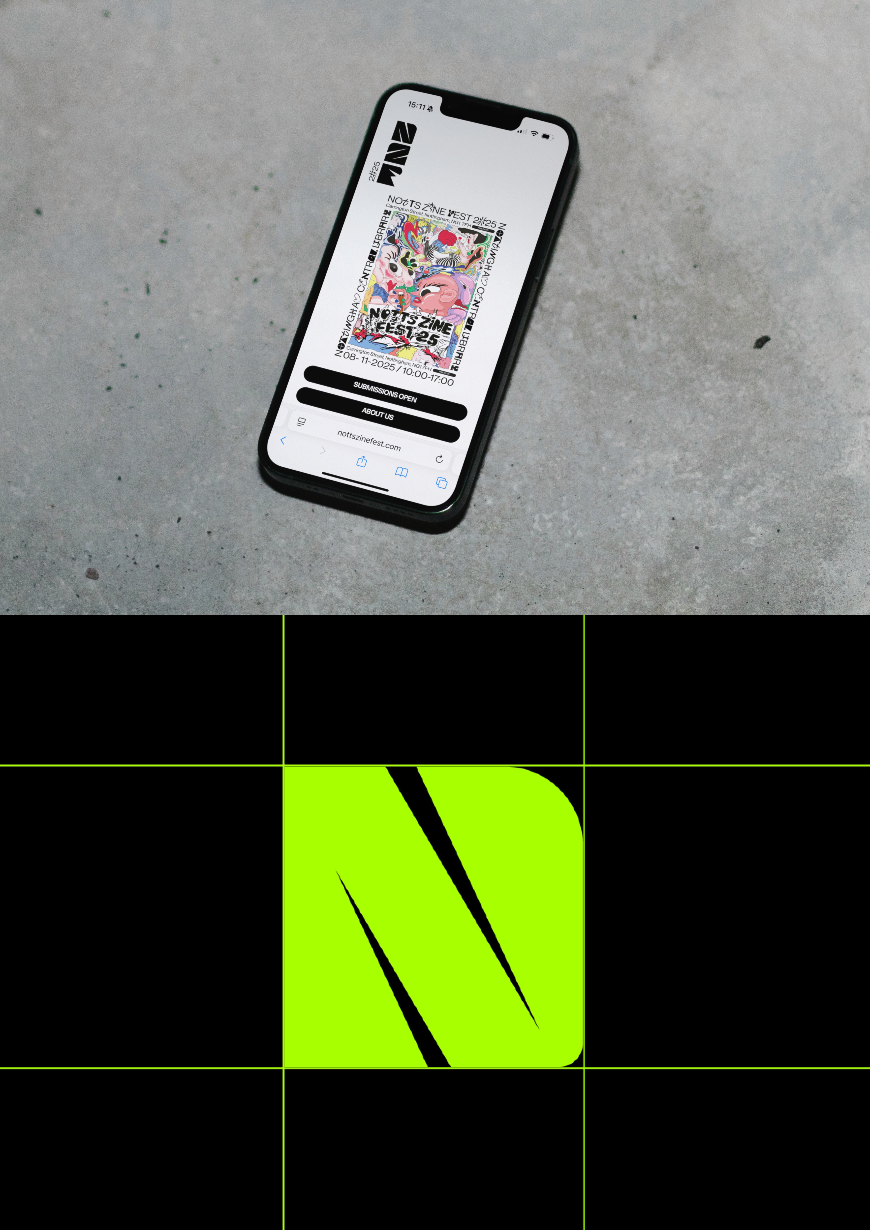
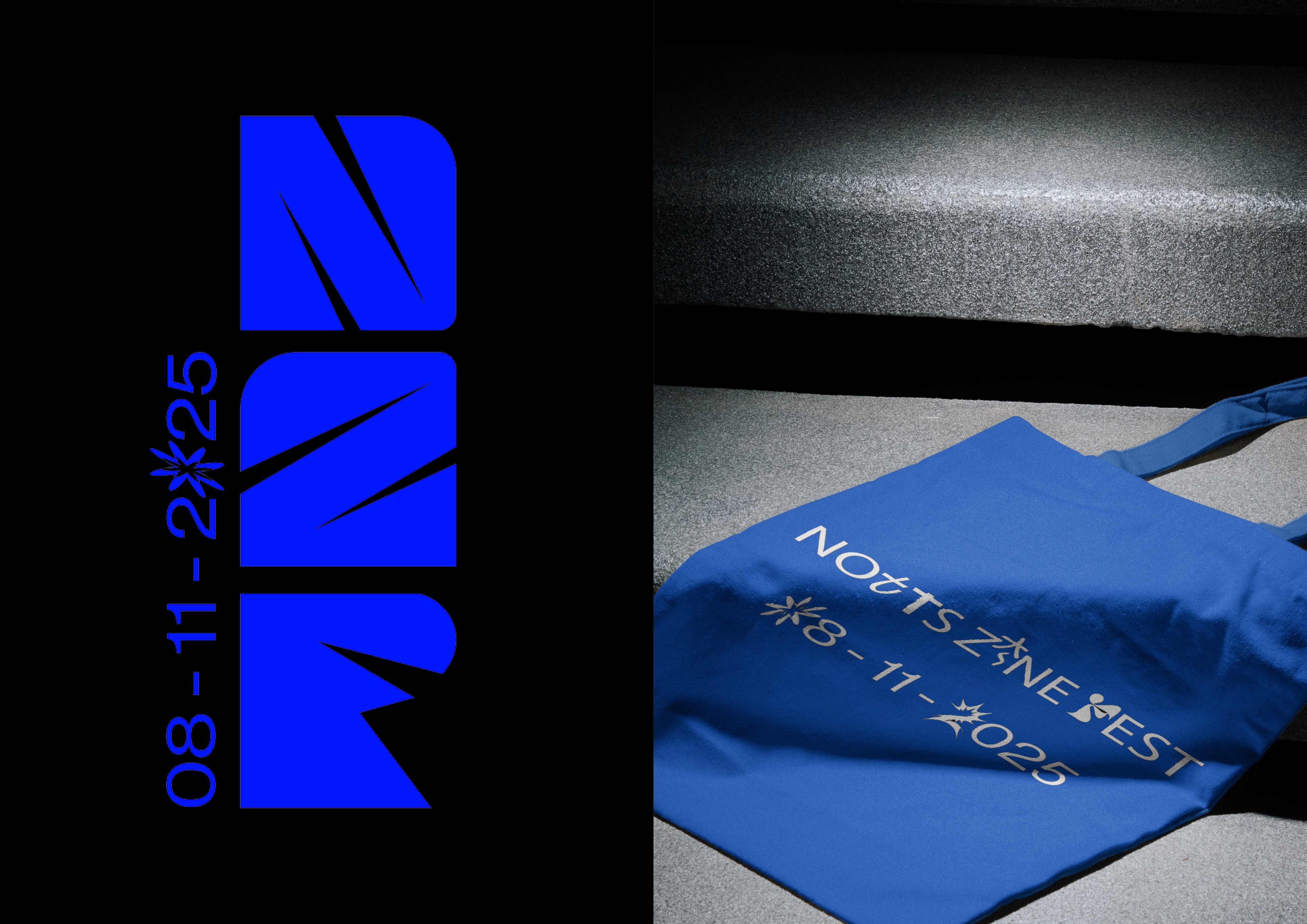
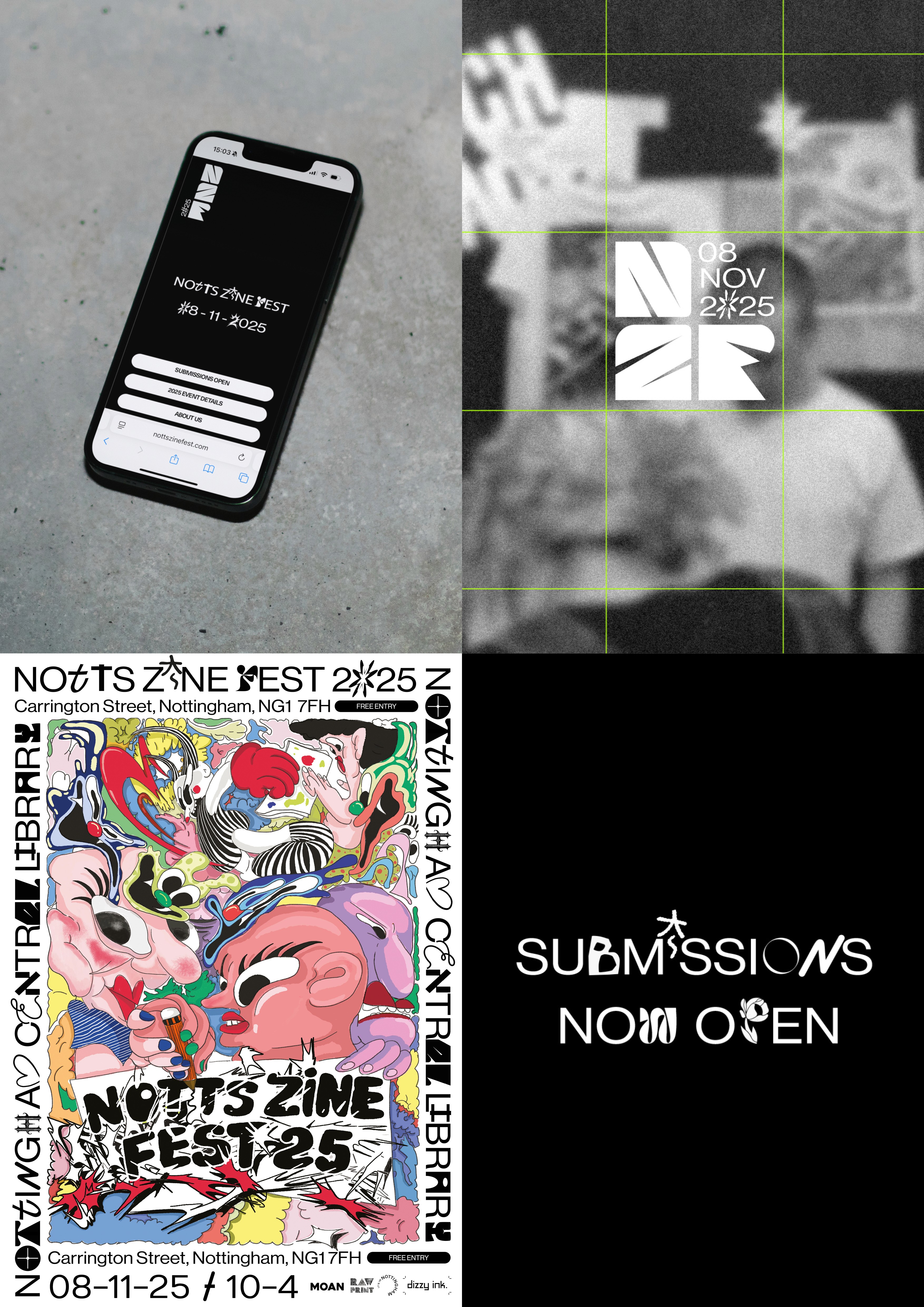
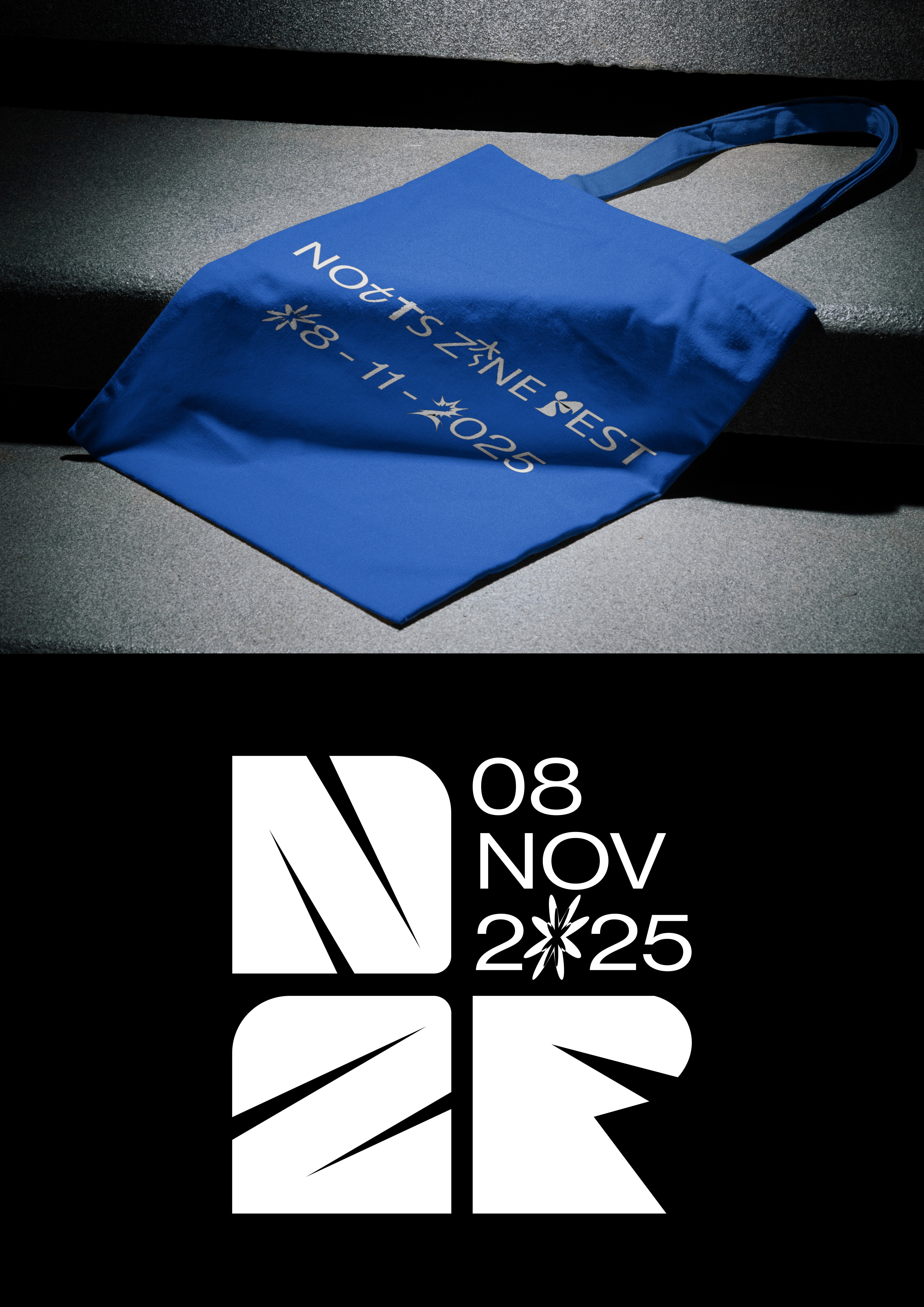
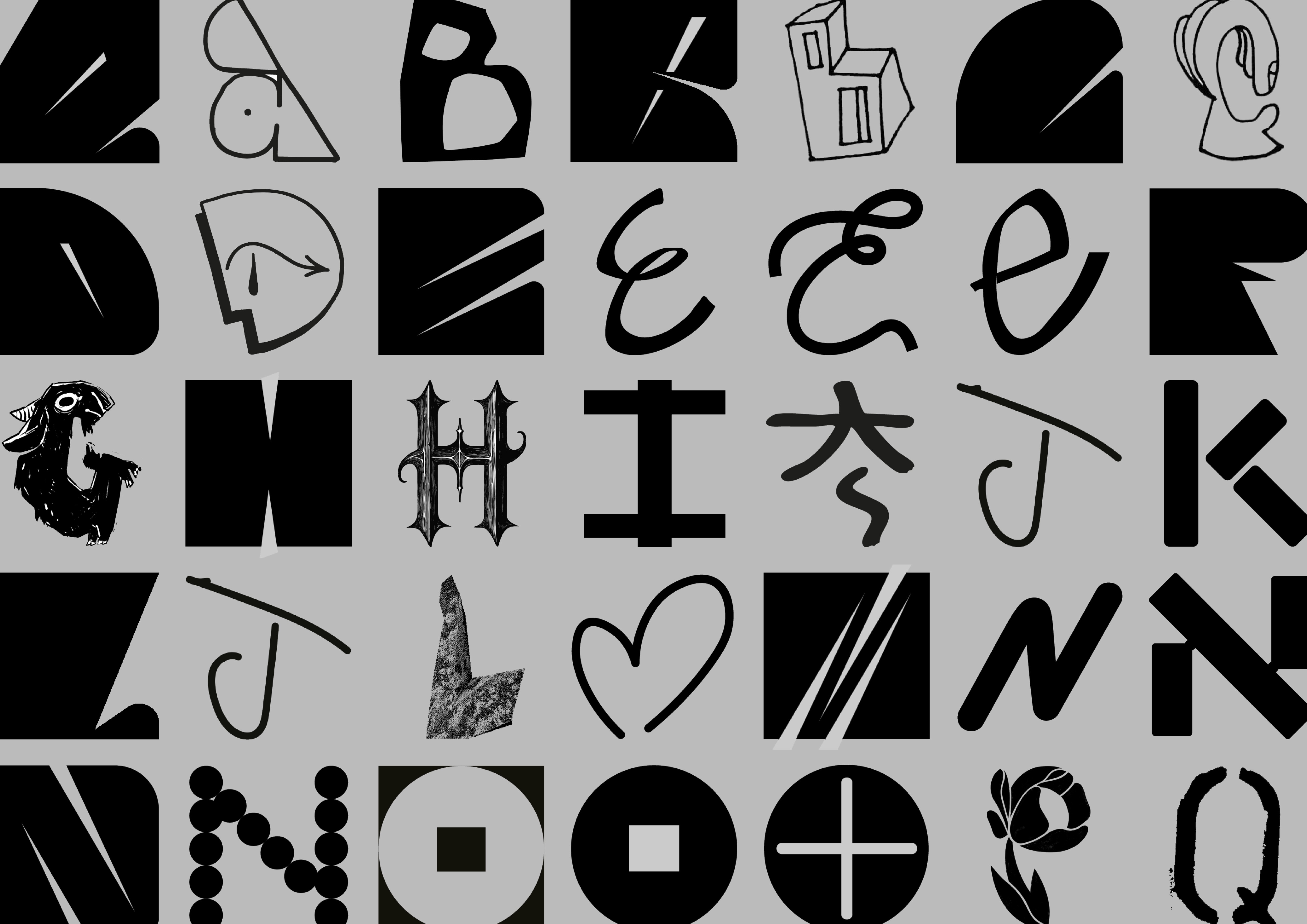
Ash & Thorne developed a 360° rebrand for Notts Zine Fest in collaboration with Dizzy Ink, creating a bold visual identity that fuses the tactile world of DIY print with contemporary digital culture. Rooted in neo-brutalism, raw print textures and Risograph processes contrast with sharp digital design and vibrant RGB colour, creating a system that feels experimental and collaborative. The communal typeface, organically built by a collective of local artists, designers and zine creators - placing collaboration and community at the heart of the brand.
Brand Strategy | Cultural Analysis | Creative Direction | Creative World-Building | Visual Identity | Visual Language | Bespoke Typeface | Art Direction | Photography & Image Direction | Print Assets | Digital Assets | Event Identity |
CLIENT: NOTTS ZINE FEST YEAR: 2026
IN SHORT:
Ash & Thorne developed a 360° rebrand for Notts Zine Fest in collaboration with Dizzy Ink, creating a bold visual identity that fuses the tactile world of DIY print with contemporary digital culture. Rooted in neo-brutalism, raw print textures and Risograph processes contrast with sharp digital design and vibrant RGB colour, creating a system that feels experimental and collaborative. The communal typeface, organically built by a collective of local artists, designers and zine creators - placing collaboration and community at the heart of the brand.
Brand Strategy | Cultural Analysis | Creative Direction | Creative World-Building | Visual Identity | Visual Language | Bespoke Typeface | Art Direction | Photography & Image Direction | Print Assets | Digital Assets | Event Identity |
CLIENT: NOTTS ZINE FEST YEAR: 2026
IN SHORT:
Ash & Thorne developed a 360° rebrand for Notts Zine Fest in collaboration with Dizzy Ink, creating a bold visual identity that fuses the tactile world of DIY print with contemporary digital culture. Rooted in neo-brutalism, raw print textures and Risograph processes contrast with sharp digital design and vibrant RGB colour, creating a system that feels experimental and collaborative. The communal typeface, organically built by a collective of local artists, designers and zine creators - placing collaboration and community at the heart of the brand.
Brand Strategy | Cultural Analysis | Creative Direction | Creative World-Building | Visual Identity | Visual Language | Bespoke Typeface | Art Direction | Photography & Image Direction | Print Assets | Digital Assets | Event Identity |